Logos with hidden meanings – too clever by far perhaps?
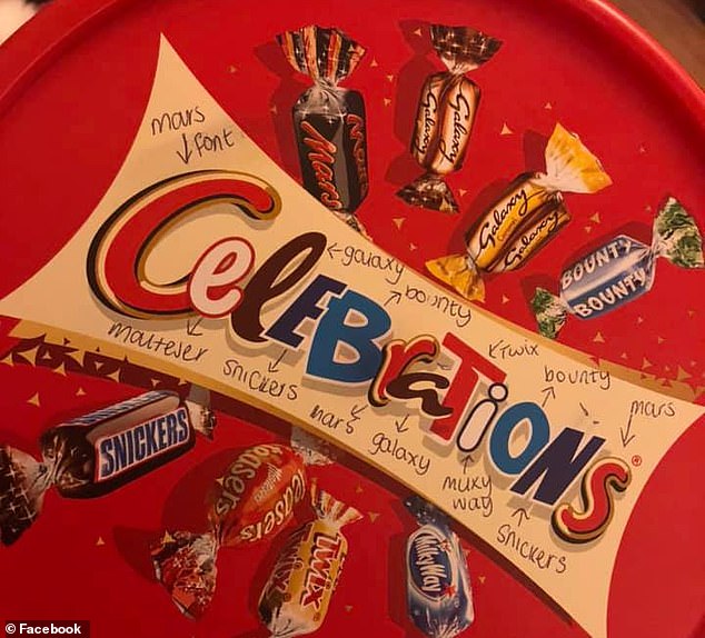
It was a post on Facebook which alerted me to the fact that boxes of Celebrations chocolates has the word “Celebrations” made up by way of the brand letters relating to the type of chocolates it contains!
Did you know that already? Am I the last one to find out?!
So - look at the image above -
- The C, r and s are in the red cursive font used for Mars bars
- The white e is used in Maltesers
- The brown l and a come from Galaxy
- The second E and N come from Snickers bars
- The blue B and o comes from Bounty
- The red T comes from Twix
- The white I from Milky Way
I do wonder if the logo doesn’t come under the “too clever by far category” as many people were so surprised at this revelation by an eagle eyed consumer that the Facebook post went viral!
Other logos with hidden symbols which may also be too clever by far
Did you know that the TOYOTO logo contains every letter of the car name?

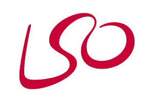
or that the London Symphony Orchestra neatly combines its initials with the outline of a conductor holding a baton. So looking below from left to right you will see a baton, the head of the conductor and his other arm.
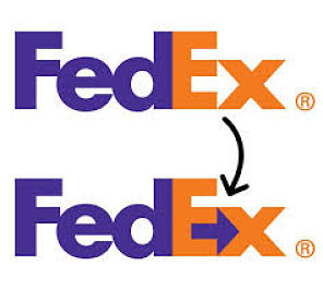
Had you realised that Federal Express has an arrow within it which once seen cannot be unseen but may just have been too subtle to convey the speed of delivery quality they wanted to capture in their logo…
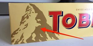
Talking of right before eyes have you ever spotted the dancing bear on the side of the mountain in the Toblerone logo?
Or more bizarrely the dead lion surrounded by bees on Tate and Lyle’s tin of golden syrup?
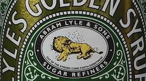
I have known about the last one for some time as I have used it in my branding workshop for many years. According to the Guinness book of records this is officially recognised as Britain’s oldest brand. It has been virtually unchanged since 1885 and came about because Abram Lyle had strong religious beliefs,
The lion has an old testament quotation beneath it. This apparently comes from the Book of Judges 14:14) when Samson was travelling to the land of the Philistines in search of a wife. During his travels he killed a lion and on his return journey noticed that bees had formed a honeycomb within the carcass. He captured this event in a riddle: "Out of the eater came forth meat and out of the strong came forth sweetness".
Surely this is actually Britain’s oldest and strangest logo?”
It takes considerable skill to create a logo so it was particularly impressive when a Stockholm based graphic designer Daniel Carlmatz challenged himself to come up with a logo a day for a year during 2017. You might enjoy the best of his clever and creative output which can be found here
Are there any other logos you have come across with hidden elements? I need you to keep me up to speed!
